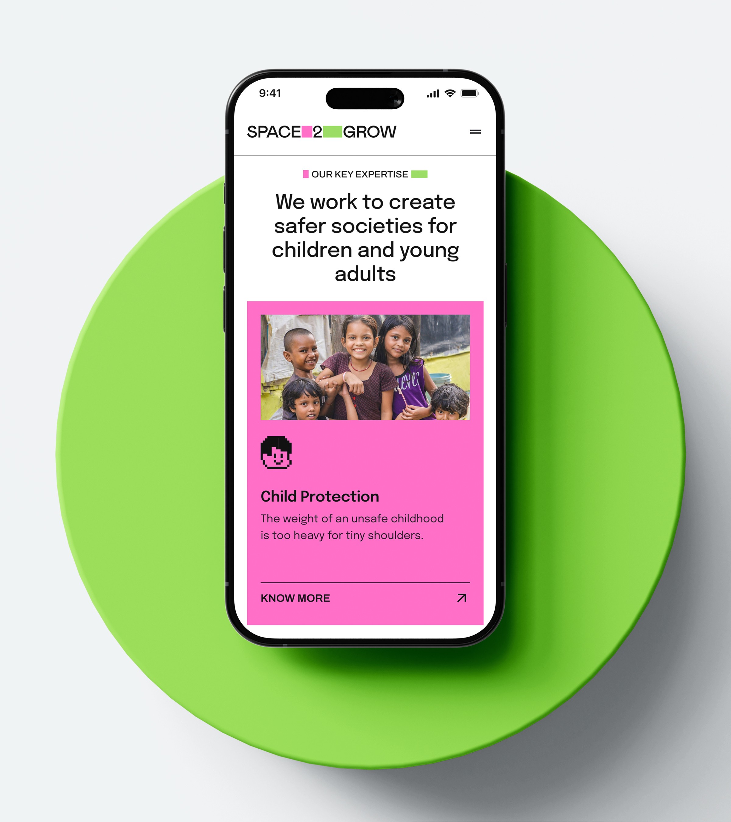
The homepage as a first handshake
Space 2 Grow’s work spans four areas. The redesigned homepage connects them through a shared grid while giving each its own colour and tone. Visitors can understand the scope and seriousness of the work before reading the details.
Colour as navigation
Each focus area was given a distinct colour and visual identity. The four areas could stand apart while still belonging to one larger system.
Concept to impact
The services page lays out the full process, from concept through strategy and implementation to impact. The scattered pixel blocks in the visual system reflect this: modules that combine differently depending on what the work needs.
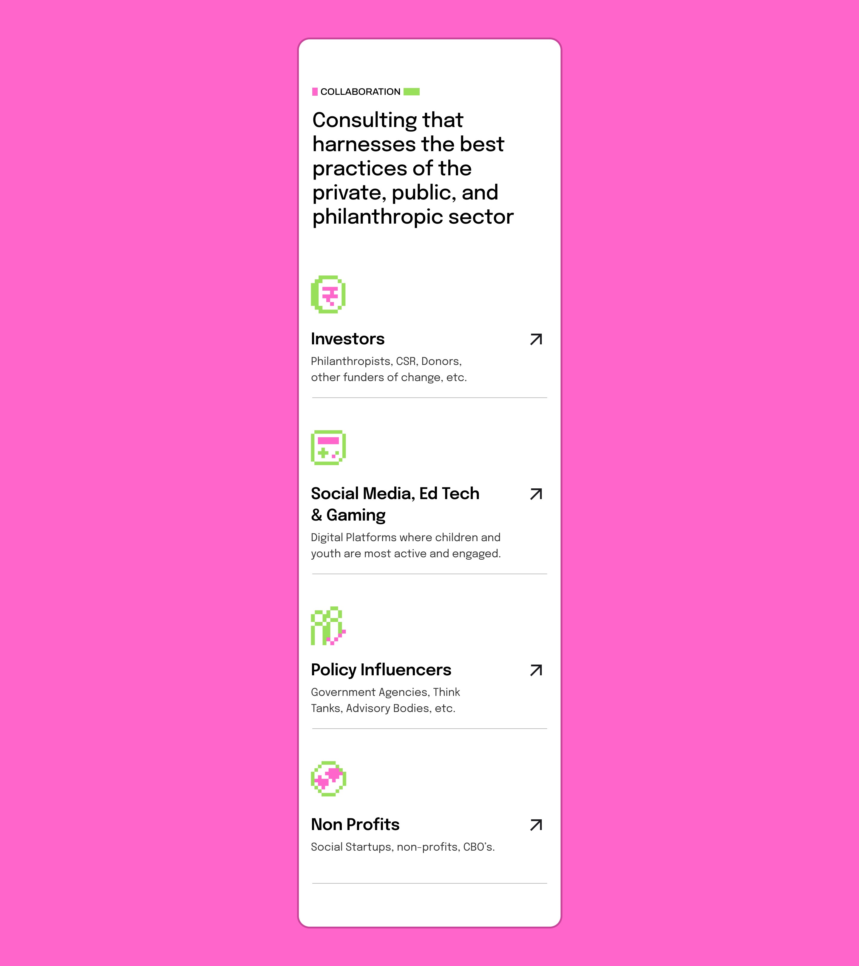
Every card knows its role
Cards, icons, labels and backgrounds all followed the same grid logic across the site, which made dense information easier to scan and kept the pages visually consistent.
A footer that carries the brand
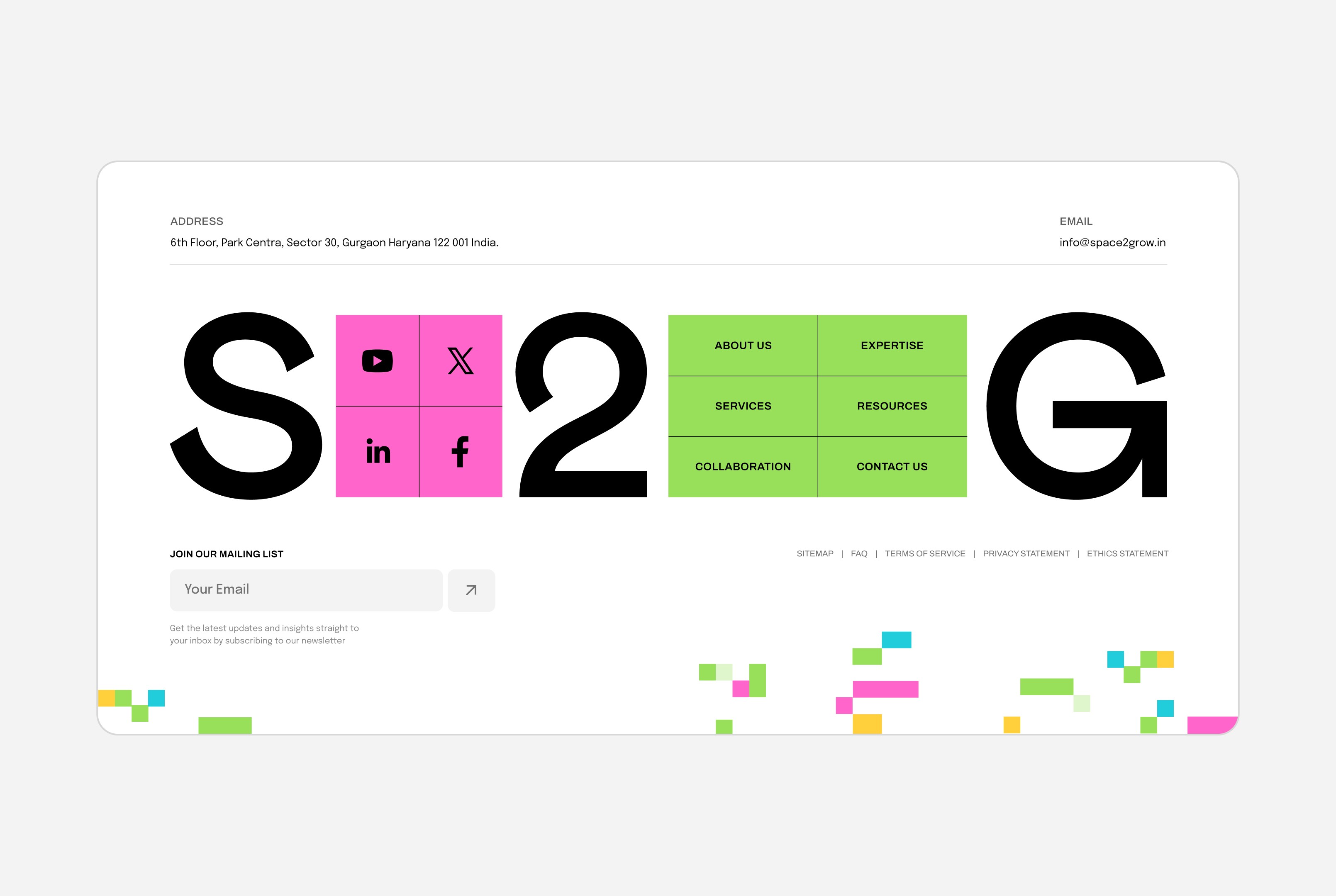
The footer was treated as a major brand moment rather than a leftover utility section. Oversized typography, social tiles, navigation grids and pixel fragments carry the system through to the end of the page.
Values that earn their space
Space 2 Grow’s seven values are given their own section on the website. Each one has a title, a number and a short explanation, and the grid layout gives them equal weight. The copy is direct: Empathy, Bias for Action, Collective Strength. The values describe how the organisation works.
Turning research into experience
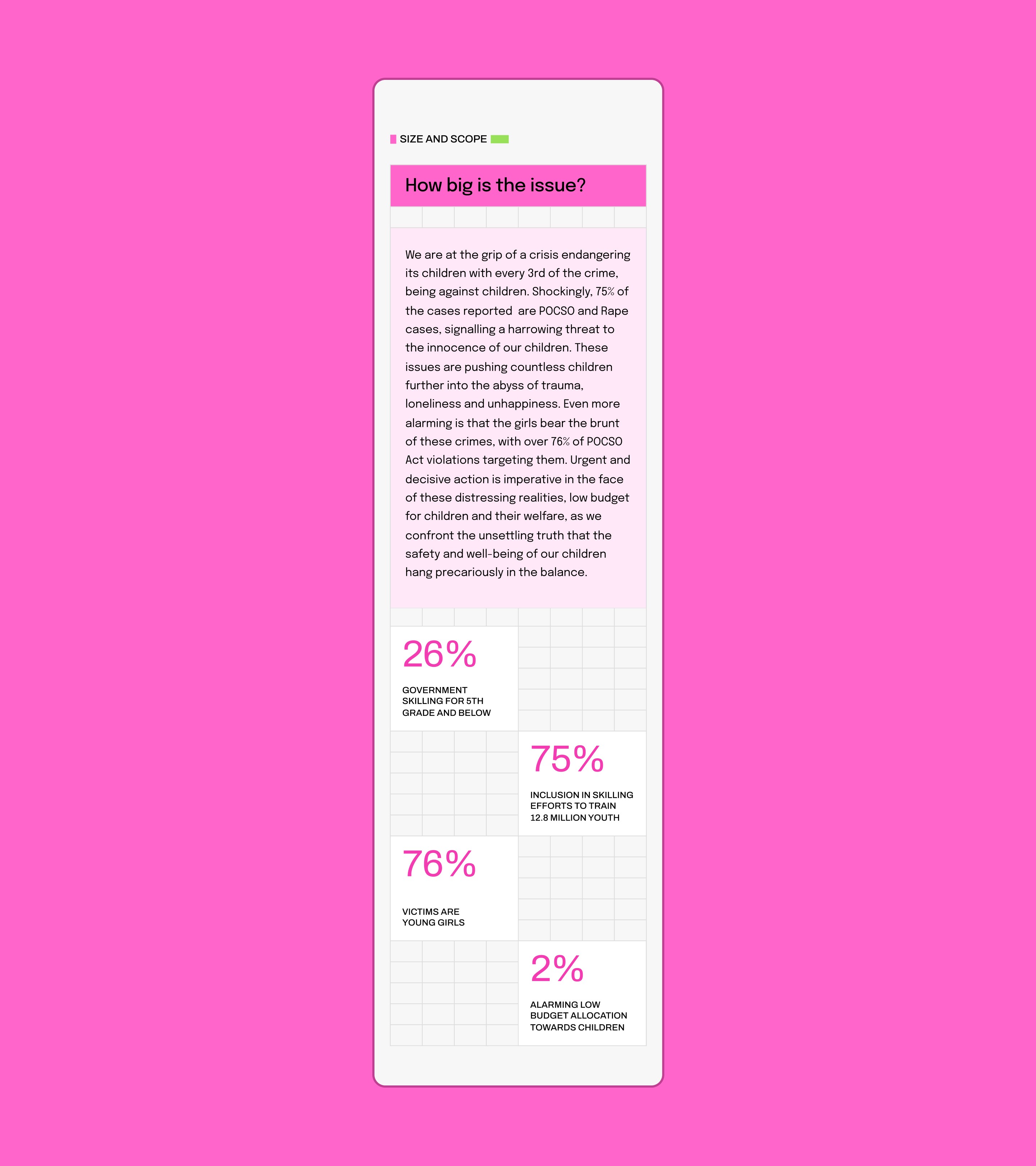
Issue pages translated research and statistics into structured, readable layouts. The design made hard realities easier to take in without playing down how serious they are.
Responsive without losing energy
Mobile layouts kept the same colour, rhythm and modular structure as desktop, so the site stayed expressive and recognisable on every screen size.
A process users can follow
The service process was broken into four clear stages: concept, strategy, implementation and impact. Visitors can see how S2G moves from thinking to action without being overwhelmed.
Resources made actionable
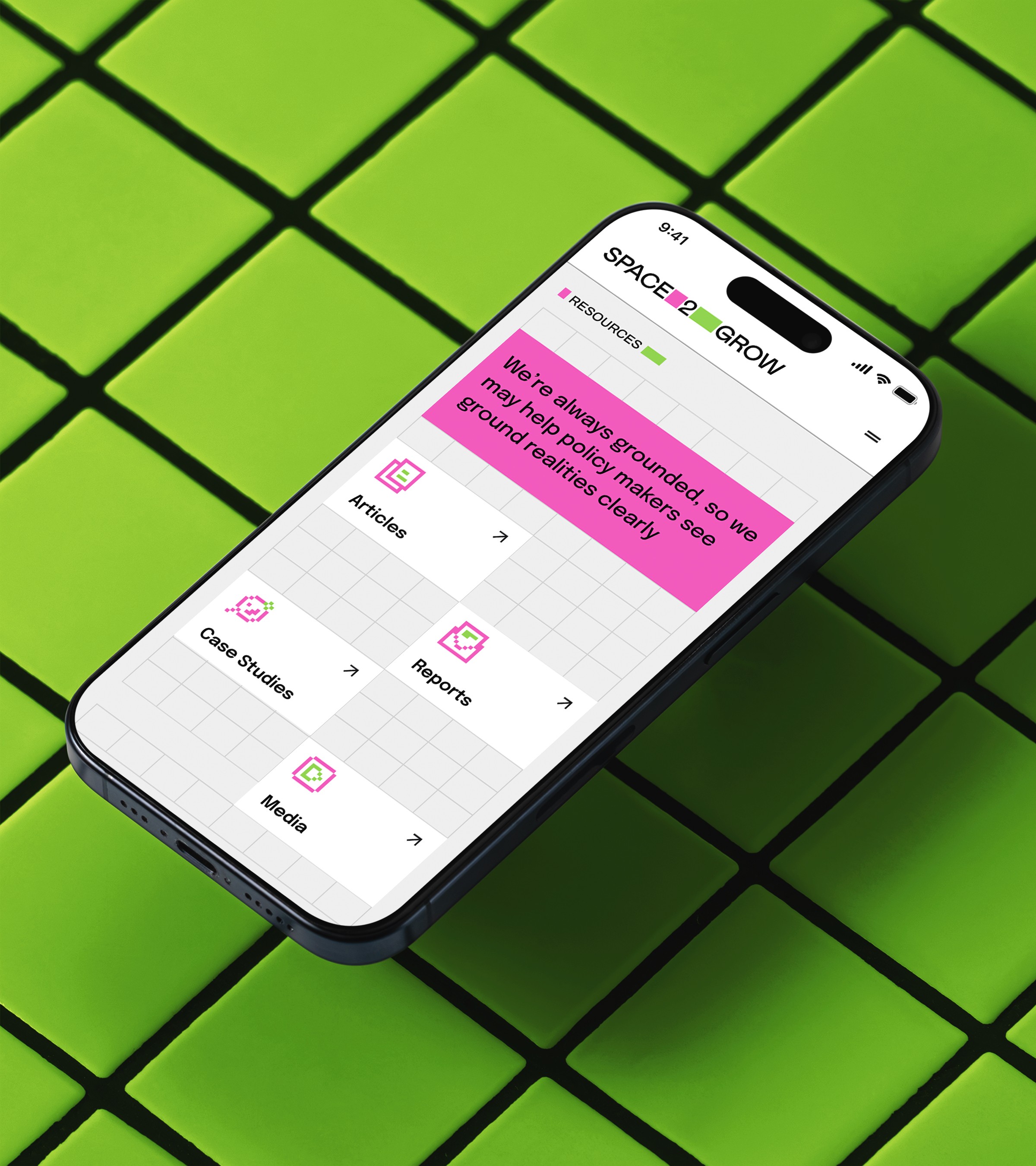
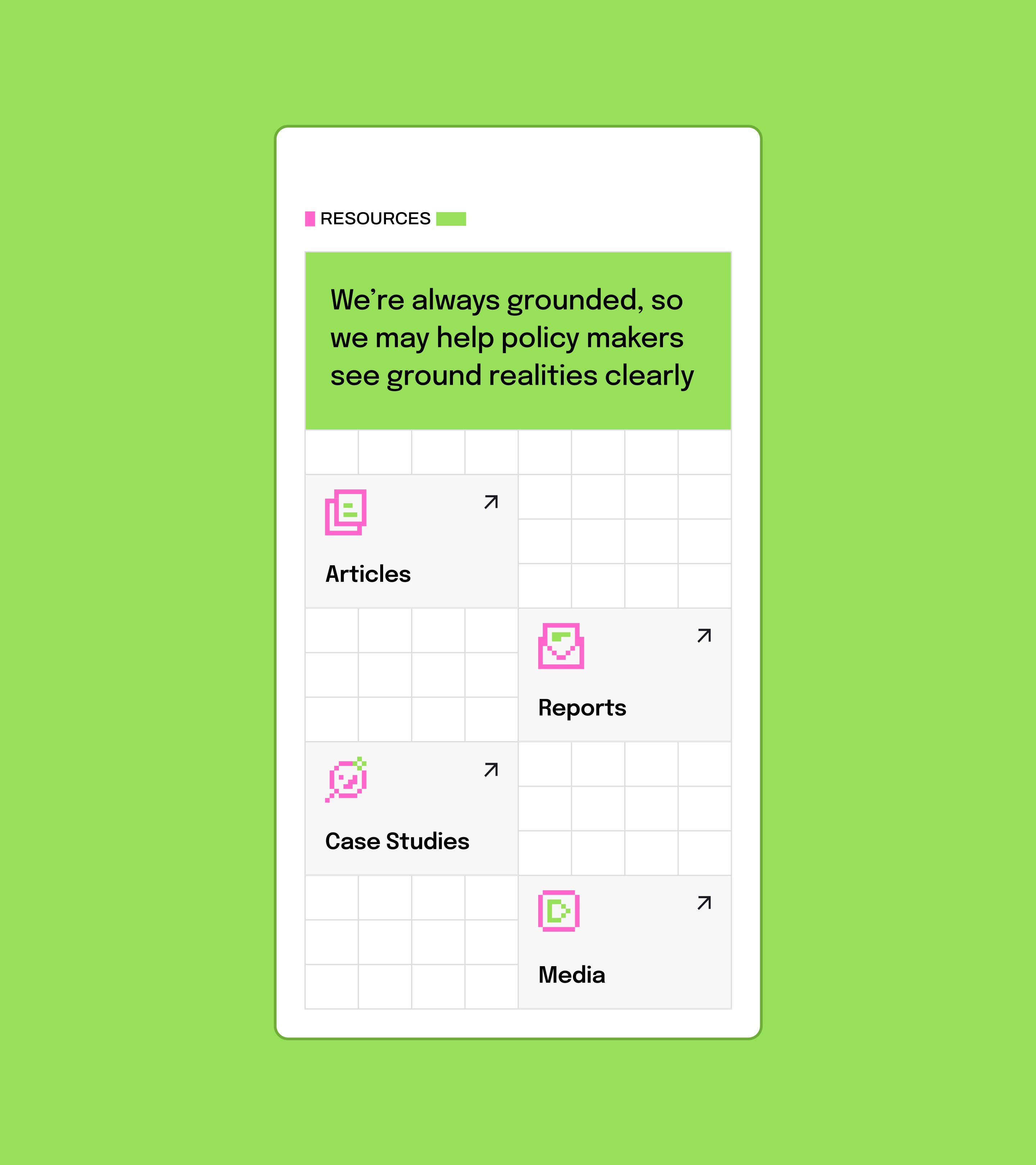
Reports, articles, case studies and media were organised into one clear resource system. The grid made them easier to find while keeping the brand’s pixel language intact.
Consulting with human context
Black-and-white imagery kept the focus on people, while bright colour blocks added energy and structure. The contrast made serious social themes feel grounded and human.

Career and partnership flows
Career opportunities, internships and partnership paths were designed as part of the same resource system, so getting involved feels clear and connected to the larger mission.


Support without breaking the system
FAQ and help pages carried the same colour, grid and pixel motifs as the rest of the site, so even functional pages felt designed and easy to navigate.
Credits
founder and creative director
Neha Tulsian
design director
Arushi Kulkarni
Designer
Naman Jain
Motion Designer
Debaangshu Sen