A page that reads like a letter
The page opens like an old letter, one section at a time. Its frames, borders and slow pacing borrow from traditional scrolls and handwritten invitations, which gives the interface a ceremonial feel.

Pacing the story
This part of the page builds gradually. It opens with quiet, airy spacing, then moves into richer contrast and larger images. The pacing feels like turning pages.
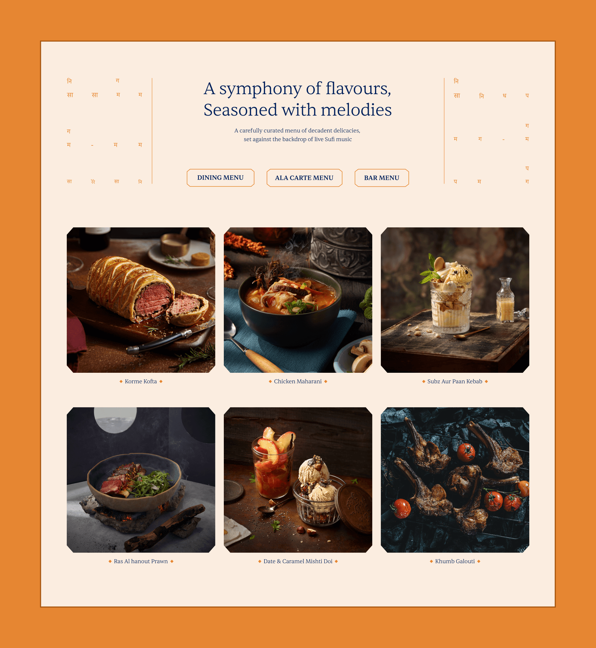
A spread of flavours
The menu reads like a well-edited page. Category choices (Dining, À la carte, Bar) set the direction, and the dish grid invites unhurried browsing. Musical notes in the margins nod to Tansen’s Mughal-era musical legacy.

A printed note, digitally
The page pauses to hand you a small note: a tall, scroll-like strip with the key details, laid out like a printed invitation. Calligraphy closes it like a signature.
A closing signature
The footer works like the seal at the end of a letter. “Tansen”, set big and bold, takes over the space and animates gently.
Credits
founder and creative director
Neha Tulsian
design director
Sujay Kamble
Designer
Naman Jain
Motion Designer
Debaangshu Sen